G'day folks!
It's been a while since my last post, but I do have a good excuse : My Wife gave birth to our first child 13 days ago.
I've looked at maybe 100 baseball cards since that day, and it really is impossible to keep up with everything going on around here.
Mr. Night Owl, I did read your comment over at Dime Boxes, and I also found that I have the other 1995 Stadium Club card you require (Eric Karros) here in my doubles pile. It will be heading your way, along with Delino.
I will email you in the morning, man!
Hopefully I'll be able to find the time to blog about cards soon enough, but at this stage I really have to prioritize my priorities!
Nick J
Wednesday, October 9, 2013

Tuesday, August 13, 2013
Fielders, and their girth.

Cecil was the archetypal power guy in the 1990's ; massive, strong, with a quick bat and slow legs.
The 4 cards above show 'Big Daddy' in the latter stages of his career, after he'd dominated the power categories for the first few years of the decade, as a member of the Detroit Tigers.
The top 2 cards are from Fleer's 1998 Ultra release, with Cecil's brief Angels stint captured in the Series 2 card.
I chose the Upper Deck and Topps cards from 1997, because any photo of Cecil running the bases is bound to bring back some humorous memories for anyone that saw him play.

I chose the 1996 Collectors Choice 'You Make The Play' card because it showed that by 1996, Upper Deck finally had a sense of humor. That just might be the Dodger fan in me, though. See Here (Thanks, Dodgers Blue Heaven!)
Going into the 1996 season, a Stolen Base was something that had never appeared on Cecil's baseball card. Then, during that season, he somehow managed to steal two, without being caught. Who said he couldn't run!?
The 1994 O Pee Chee card is one that shows exactly why Cecil was (and probably still is) feared by anyone who should do him wrong. Guy was a freakin' Bear!
I also really like the 1986 Donruss card of Cecil depicted here. Although the card design may be lacking, it seems to suit the Blue Jays cards rather well. Imagine if Donruss had Team-Color-Coded horizontal lines that year? Red horizontal lines for Red Sox, Reds & Cardinals cards? Yellow lines for Pirates cards? I dare you to attempt to convince me that wouldn't have been an improvement!

I'm sure I've mentioned it before, but I wish Topps had switched the Opening Day color scheme with the flagship color scheme in 2007.
There's something about the black-bordered cards that just seemed 'below-par' to me. Maybe I was just used to the white bordered sets that had been used since 2004.
Topps clearly agreed with me, as they have used white bordered cards ever since, and will continue to do so in 2014.
The top 2 cards show a perfect comparison of the Topps photoshop process at work. I think it's a shot from PNC Park in Pittsburgh, and the Brewers photo is (obviously) the real one. Maybe that's why Topps don't have "The Real One" on the front of their packs anymore, because most of the photos aren't real.
Although they're plain and simple (and similar), I really like the Fleer sets from 2006 and 2007. I chose to display the 2006 Fleer card of Prince, essentially because I've had the 2007 card for a lot longer, and the photo is old, and therefore, boring to me. Good logic, eh?
Next post will have a lot more photos of a lot more cards.
Although I haven't been able to decide on the topic just yet.
To you guys who blog about a different theme/topic each and every day : A massive tip of the cap to you. I really don't know how you get so many great ideas, and continue to do so, without any loss of quality.
You're all inspiring to a complete amateur like me, and I promise that I will try not to completely steal ideas from you. Although, if I do, I will obviously offer some kind of bibliography. Links should do it!
Cheers,
Nick J
Wednesday, July 24, 2013
Just something I noticed...

I couldn't get a nicely focused photo of the front of the card, but here's a stolen pic :

I turned the card over, and here was the back :

I'm pretty sure the formatting here blows, but let me just say I think all of these pics are from the same play, based of the marks on Mike's left knee.
Man I hope the pics are aligned...!
Nick J
Monday, July 22, 2013
Anaheim Fish
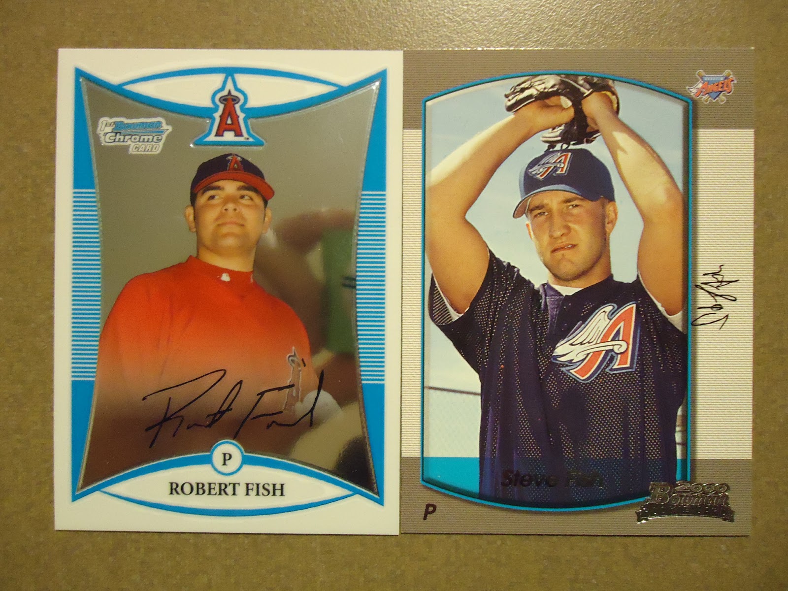
They're both Angels players, so I guess they'd make a great team along with Tim Salmon and Mike Trout.
I present to you, Robert Fish (2008 Bowman Chrome Prospects #142) and Steve Fish (2000 Bowman #289). They're two more Angels players with oceanic names, and I can't recall a more seafood-named franchise in the history of any sport.
Except the Marlins, Rays or Dolphins...
Sunday, July 21, 2013
A Heart-Warming Short Story

After getting beaned on the first and only pitch he saw in the Majors, (I think it was 2004 or 2005), Adam Greenberg disappeared from the Majors, apparently never to be seen again.
He signed a one-day contract with the Miami Marlins last year and made it back to the Majors for a very heart-warming single at-bat.
He may have struck out on 3 pitches, but it was no disgrace. He K'd against a guy who was dominating the league on his way to a Cy Young Award, (R.A. Dickey), and I'm guessing nobody left the stadium that day with dry eyes.
I had trouble recalling if I owned a card of Greenberg's from his Cubs days, but thanks to 2004 Topps Total, I have one in my collection.
Thank You, Topps Total,
You are still sorely missed in the collecting world.
Nick
Juan Two Three Four...
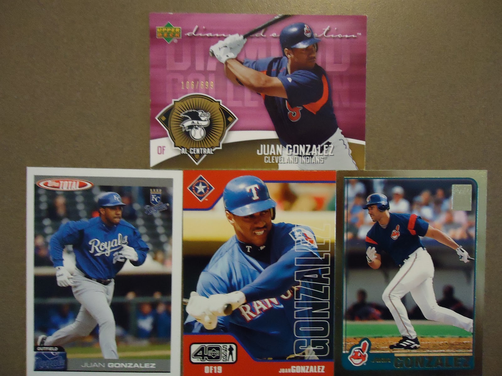
Now I've never been a massive fan of Juan Gonzalez, but I have to respect what he accomplished in the Major Leagues. And I'll Blog about him because that's the pile of cards I'm currently viewing!
I always seemed to get his cards whenever I bought packs during his playing days. Enough of them, in fact, to land me 206 of Juan's cards.
Included in the above (blurry, sorry) photo, is a 2006 Upper Deck Diamond Collection card, which is the only 2006 card I have of Juan's. He didn't even make it into the 1250-card main set that year, which is odd. That card, visibly or not, is actually numbered 106/699, so I must have a 'Gold' or 'Bronze' variation.
The following 2 cards are from my 2 favorite sets this century : Topps Total (2004) and Upper Deck 40 Man (2002). It doesn't look like we'll ever see either of these sets again, so I'll just have to live in the past.
Lastly, the Gold-Bordered card is from the 2001 Topps Traded set, and is also numbered 0052/2001. Juan came back in a big way in 2001 after a disappointing year in Detroit. He hit .289/22/67 in 2000, then mashed .325/35/140 for the Tribe in '01.

The second card looks a lot like the original 1989 Upper Deck release, but it's been given the typical late-90's facelift, complete with shiny foil surface and shiny foil stamping. I never noticed until just now, but that card is also numbered 0186/4000. Just so you know, it's from the insert set called '10th Anniversary Team', which perfectly explains the 1989 design.
There's yet another very '90's-looking' card at the bottom left, from 1997 Upper Deck. It's a one-per-box insert, from memory, and is actually pretty impressive to look at when it's in your hand.
I chose to include that 1997 Donruss card because I'm a sucker for throw-back uniforms. Also, it's card #1 in that set.

We arrive at the year 1995, and, man... what a colorful year that was for cards! At least, the top 2 cards here are from 1995.
There's a 'Rising Star' insert from 1995 Ultra, and a 'Ring Leader' insert from 1995 Stadium Club. I always thought Topps tried too hard with their inserts, but I actually like the way this card refracts when you move it.
The card at the bottom left is from 1994 Stadium Club, and I think it was from a 3rd series pack. They're called 'Finest Inserts', a wildly imaginative title for the set.
I love Fleer Pro Visions. And this one, takes the prize of my favorite of all time. So much color. The coolest brand of bat ever, and the yellow brick road with horses near it. Just cool!
I threw in the last card there because it's from 1993 Upper Deck, and it shows Juan being kind to some kids. Good fellow, he is.

The first card is from the 1992 Upper Deck Ted Williams Best Hitters insert set. On the back, Williams predicts Gonzalez to be a 'Sure MVP'. Teddy Ballgame wasn't wrong...
The 1991 Ultra card is from the formerly-over-valued Update set. I think, according to Beckett, this card was worth around $20 in the middle of the 1990's. Glad I waited until 2011 before buying the set for around $5.
I love the Mirror-image Rookie Card that Donruss produced in 1990. The cynic in me says it was a deliberate error. The cynic is probably right, too. I'm just glad I found the error version in some random shop on the Big Island of Hawaii about 20 years ago. Despite being a tad faded, it still remains one of my favorite cards of Juan's.
Well, thanks for reading, I hope you enjoyed our quick look back at the card career of one the 1990's greatest sluggers, Juan Gonzalez.
Nick J
Saturday, July 20, 2013
Danny Tartabull - A Quick Look...

Or, at least, picture one card for each team he played for.
Danny will always be one of my favorite players of all time, not just because he was a good hitter, but because of his legendary appearance on my favorite show of all time, Seinfeld. (If you need to check it out, Danny appears in the 6th Season Episode, 'The Pledge Drive').
I chose these two cards because the borders matched the uniforms.
I love team-color-coded cards.
LOVE them!
Even though these two cards are team-color-coded by default, I still rate them as two of the best Tartabull cards of all the ones I own. (I just checked, and I have 127 different Tartabull cards).

The moment that my complete set of 1996 Donruss arrived at my door, my 'Bull' collection was complete.
To this day, I still only have three cards of Danny with the A's - this '96 Fleer card, as well as the '96 Donruss #548, and the '96 Score #339.
That '92 Fleer card is from the Update set. That set was (and still is) way over-valued when it comes to a certain price guide magazine. I bought it for what I thought it was worth. From memory, it was about $10.

I also own only three cards which showcase Danny's tenure with the Phillies, this Pacific issue, as well as the '97 Fleer #614, and the '97 Score #448.
The fact that he has at least three cards with the Phillies is incredible, considering he only played 3 games for them in 1997, with a grand total of zero hits from 7 at-bats.
Despite that, he had a great career.
And I'm sure if Danny Tartabull were here, he'd say "That's right, Nick".
Subscribe to:
Posts (Atom)